Wheelhouse brand redesign
brand design; identity design; design systems; website design
Evolving for a new northstar.
Wheelhouse DMG, a digital marketing agency specializing in first-party data and HIPAA-compliant solutions, needed a brand refresh to match their newly defined focus on health and tech. The goal? To elevate their identity and digital presence while keeping the essence of their established brand intact.
Wheelhouse wasn’t looking for a complete reinvention, but a refined, more distinctive visual language that felt modern and aligned with their forward-thinking approach.
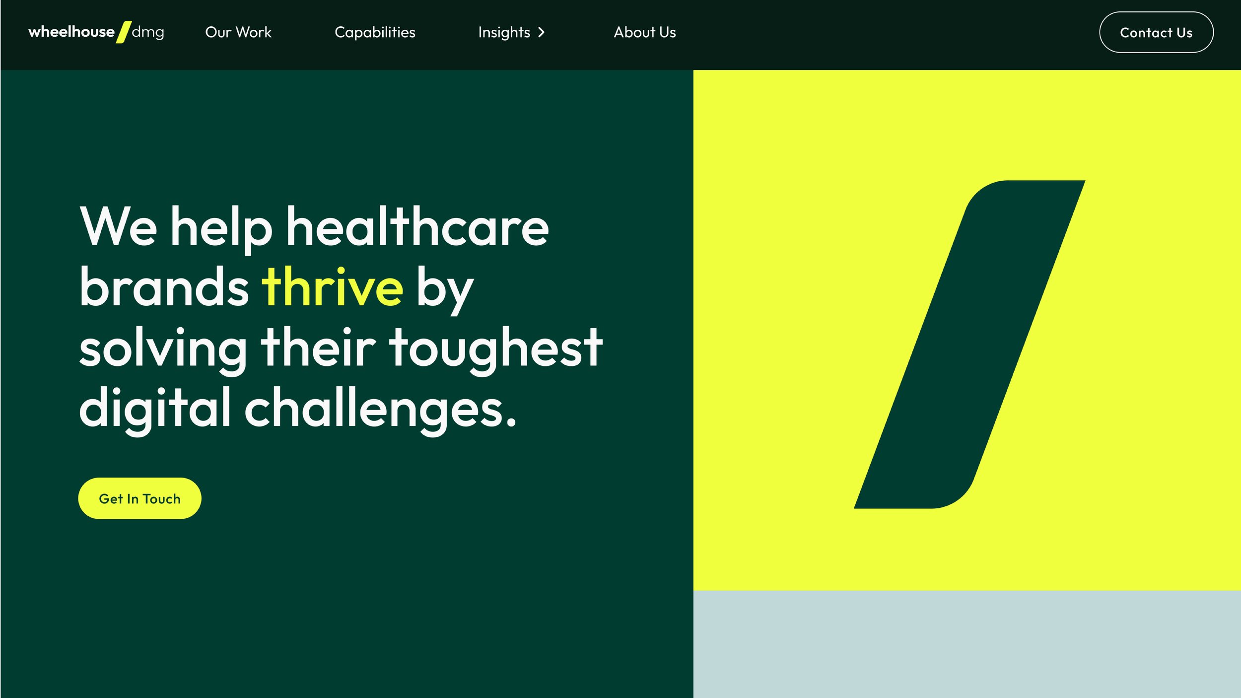
As the creative lead and designer, I began by focusing on the forward slash (/) from their old logo—a simple yet powerful symbol that could serve as the cornerstone of the new identity. The slash embodies the connection, support, and partnership that Wheelhouse champions with its clients, and it felt like the perfect representation of the brand's core values.
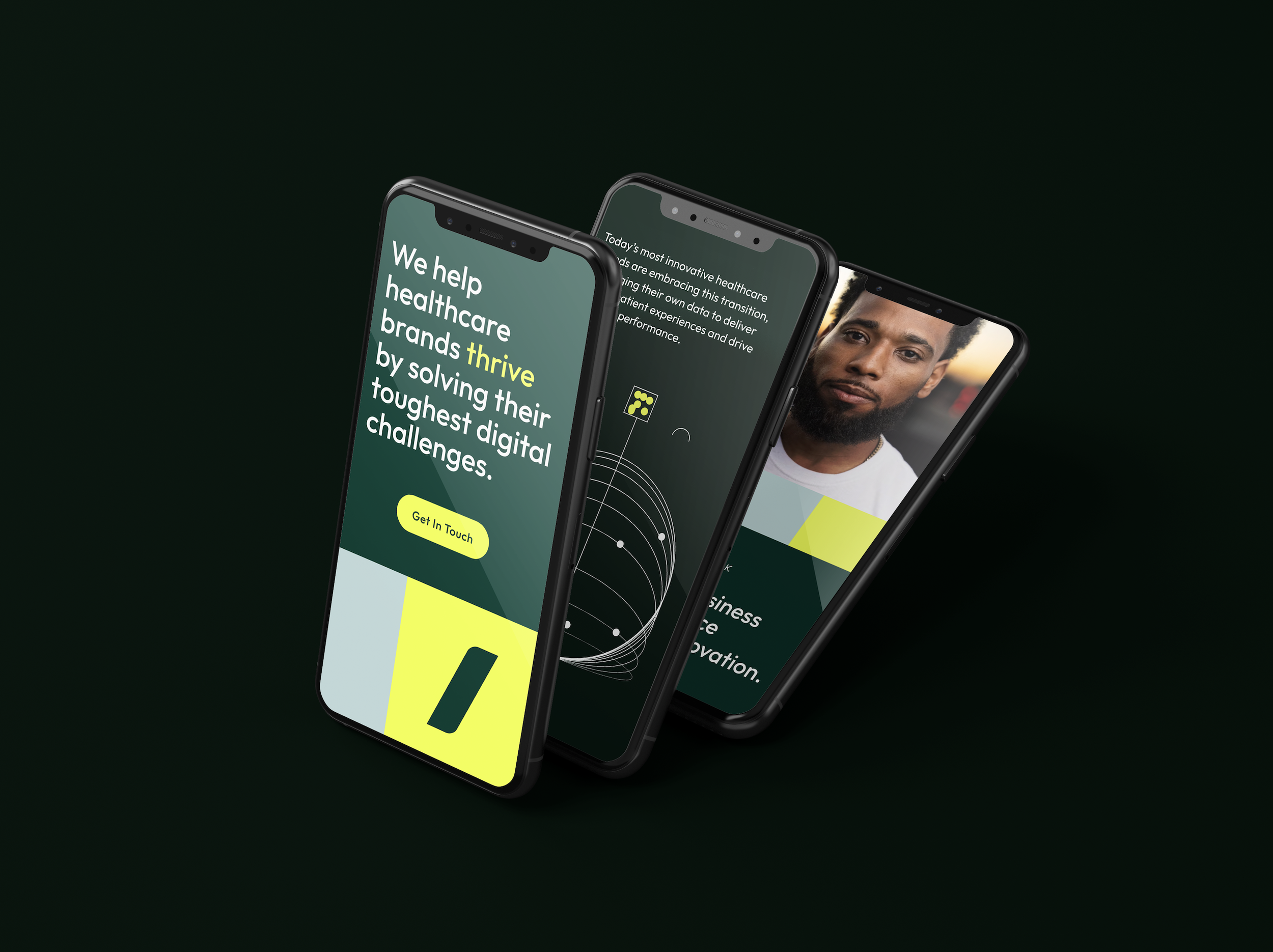
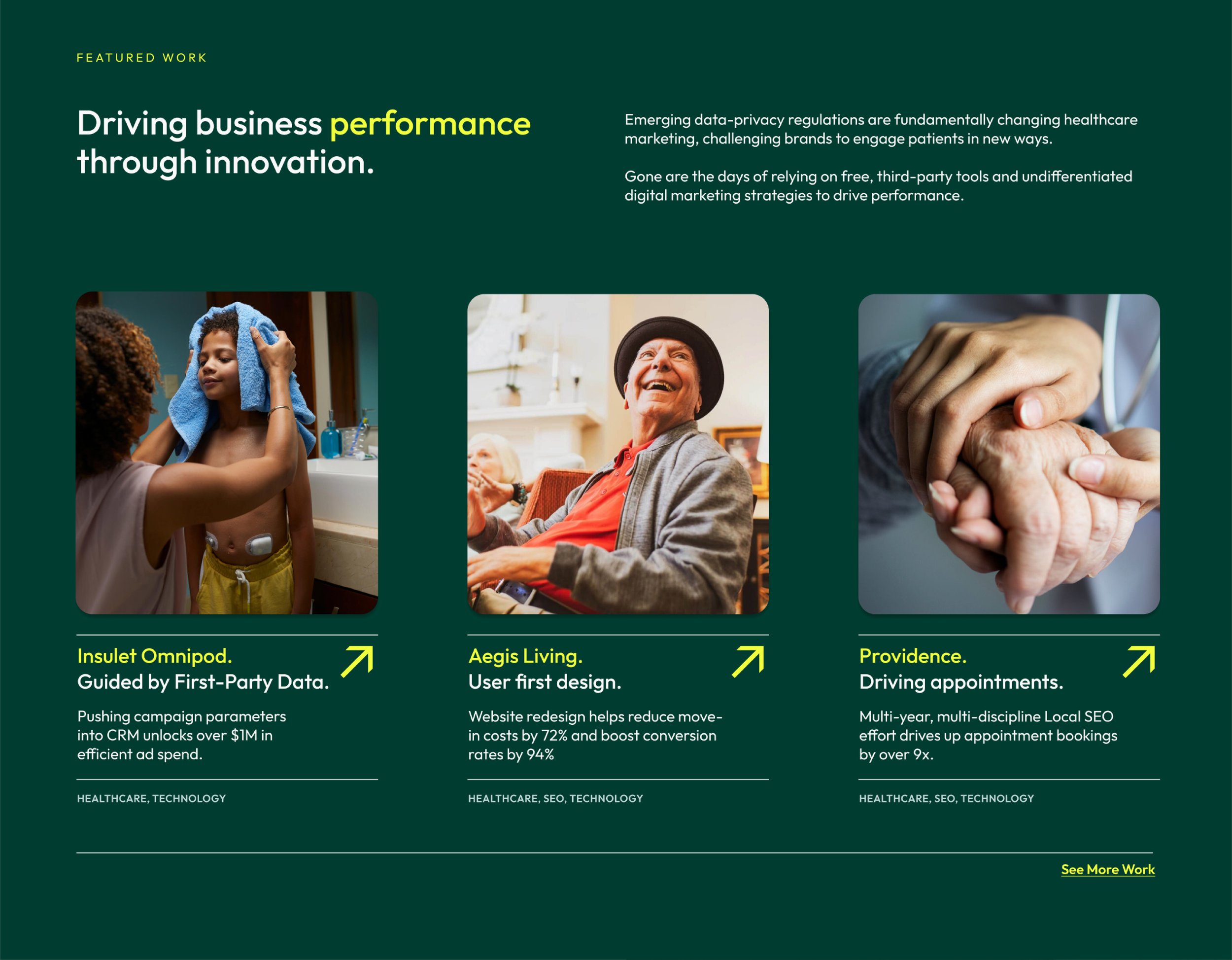
From this starting point, I crafted a complete design system, redefining the color palette, graphics, photography direction, and website design. The new identity is bold yet approachable, with a tone that speaks to the innovation and trust that Wheelhouse delivers in the health and tech space.
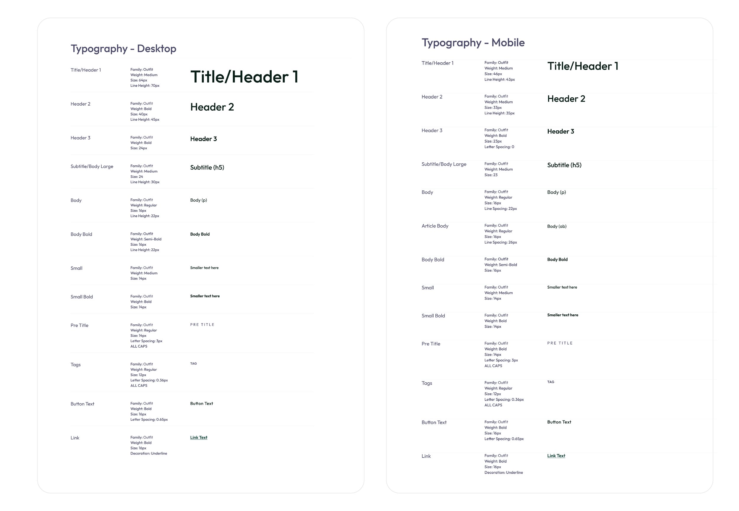
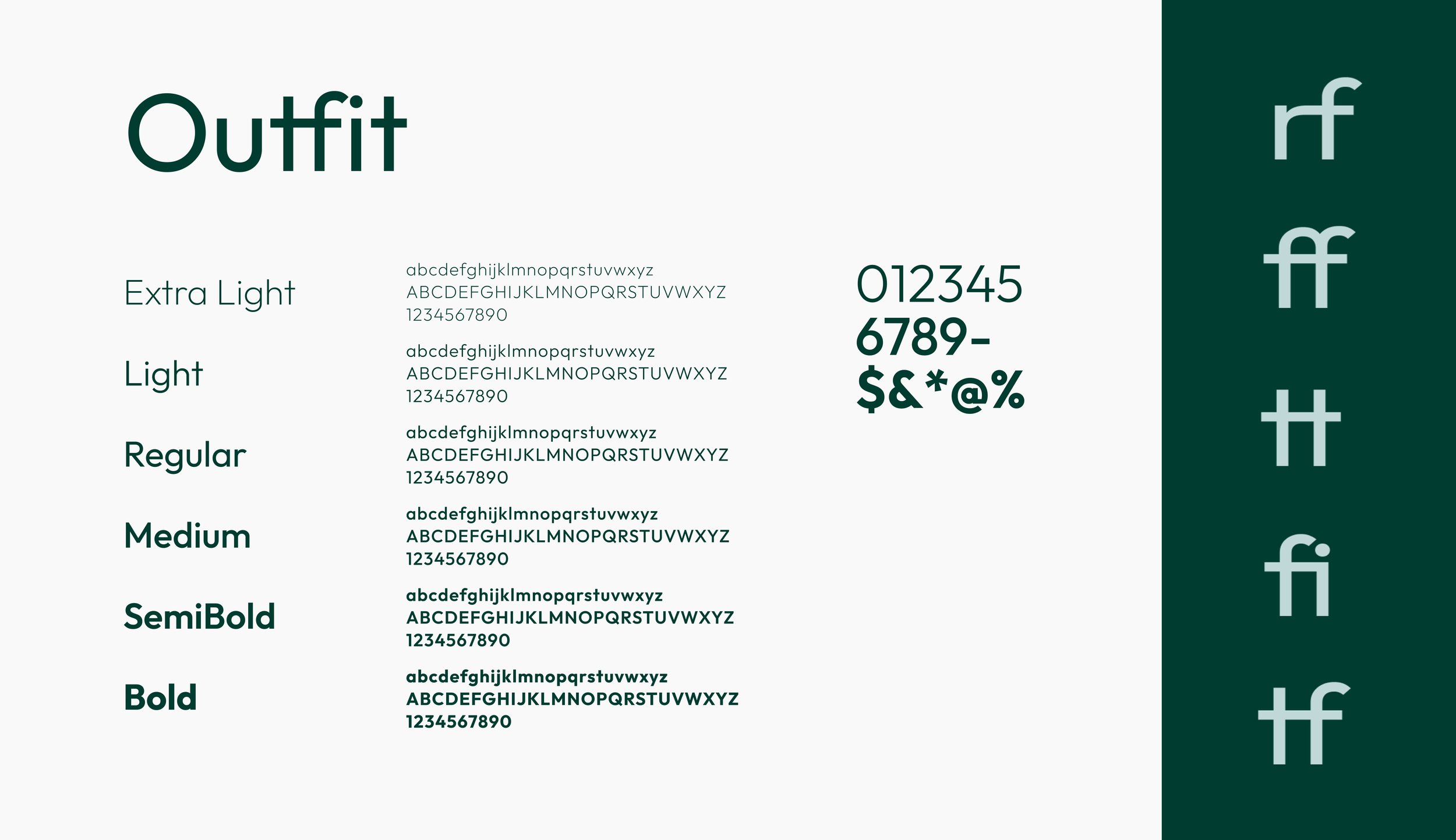
Typeface: Outfit
Clean, modern, and effortlessly readable—Outfit is a typeface that mirrors the Wheelhouse ethos. Its rare ligatures form meaningful connections, just as Wheelhouse builds strong partnerships with its clients.
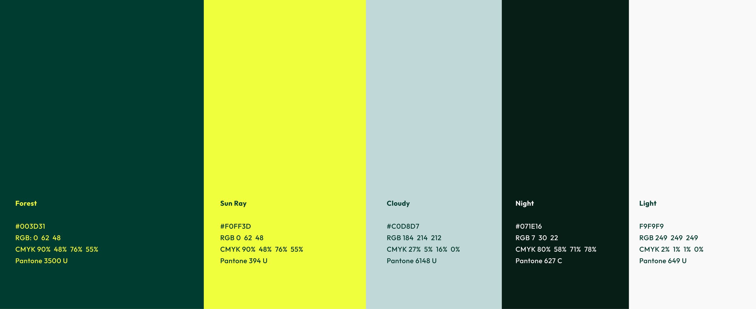
Color Palette:
We refined the color palette to convey vitality and health—greeny blues with touches of bright yellow evoke a sense of life, grounded in nature. This harmonious palette offers flexibility, allowing for bold statements or soft nuances, depending on the moment.




Building the website design system.
In addition to the brand design, I led the creation of a comprehensive website design system, ensuring that the entire site reflected the new brand identity at every touchpoint. The design system prioritized accessibility, with a focus on making the site inclusive for all users by adhering to web accessibility standards (WCAG). From visual elements to user interface components, the system was built to maintain consistency across all digital platforms. I developed detailed UI guides, including typography, color palettes, iconography, interaction patterns, and accessible design practices, ensuring the site was both visually engaging and user-friendly. This foundation allowed for scalable, future-proof design and easy updates, aligning with the brand’s evolving vision.
